Form Builder
The Form Builder page allows you to create customized forms used in the organization such as:
- Probation Feedback Form
- Consultation
- Employee Performance Review
- Client Feedback
- Training
- Survey
- Managerial Review
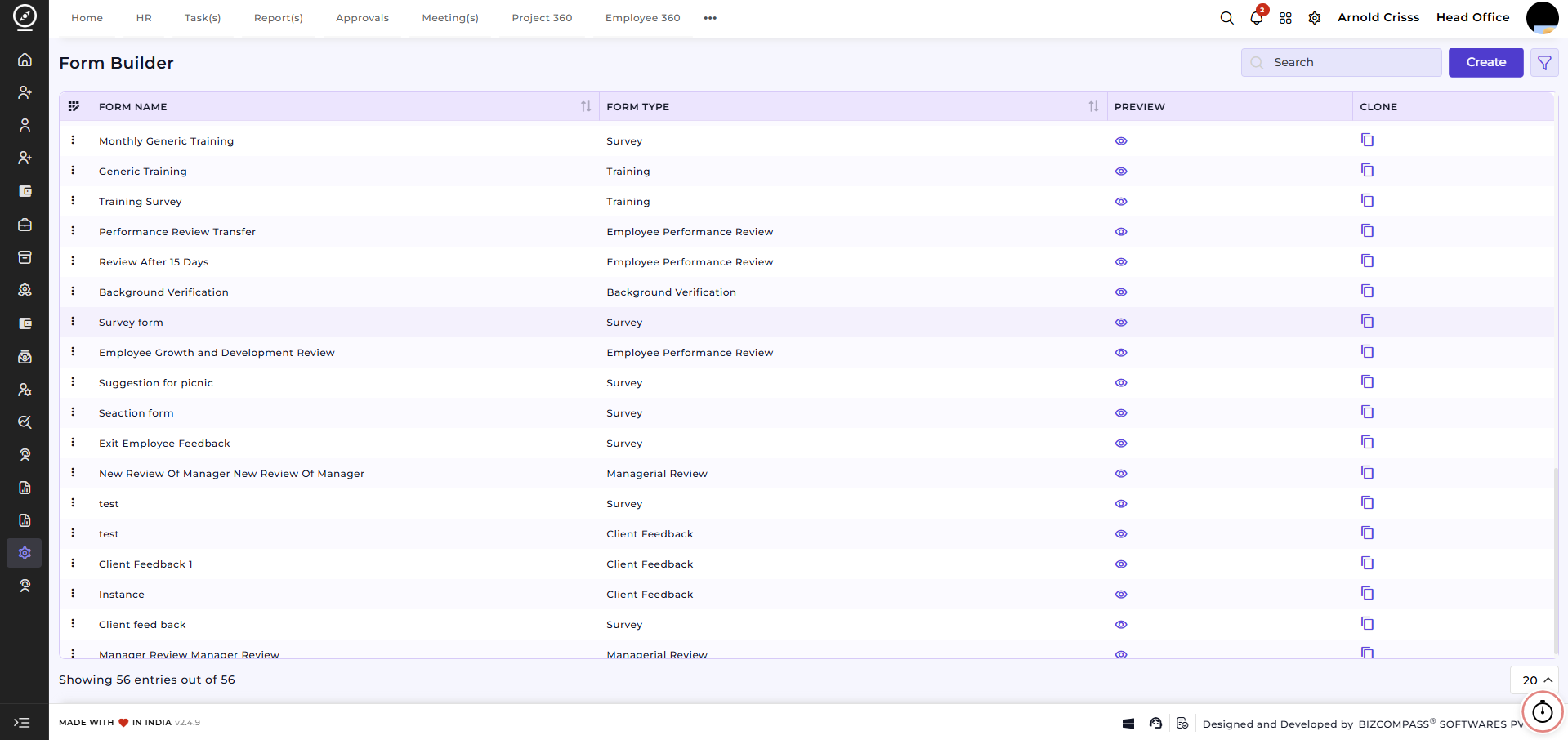
Create Form:
- Enter your Form Name (e.g., Aatapi Wonderland Trip)
- Select the Form Type (e.g., Survey)
- Optionally add the Background Theme and Theme Color for the form.
-
Define who can Access Form Responses:
-
Designation – Restrict access to specific roles.
-
Department – Restrict access to specific departments.
-
Person – Restrict access to specific individuals.
-
- Enter the Description for the form.
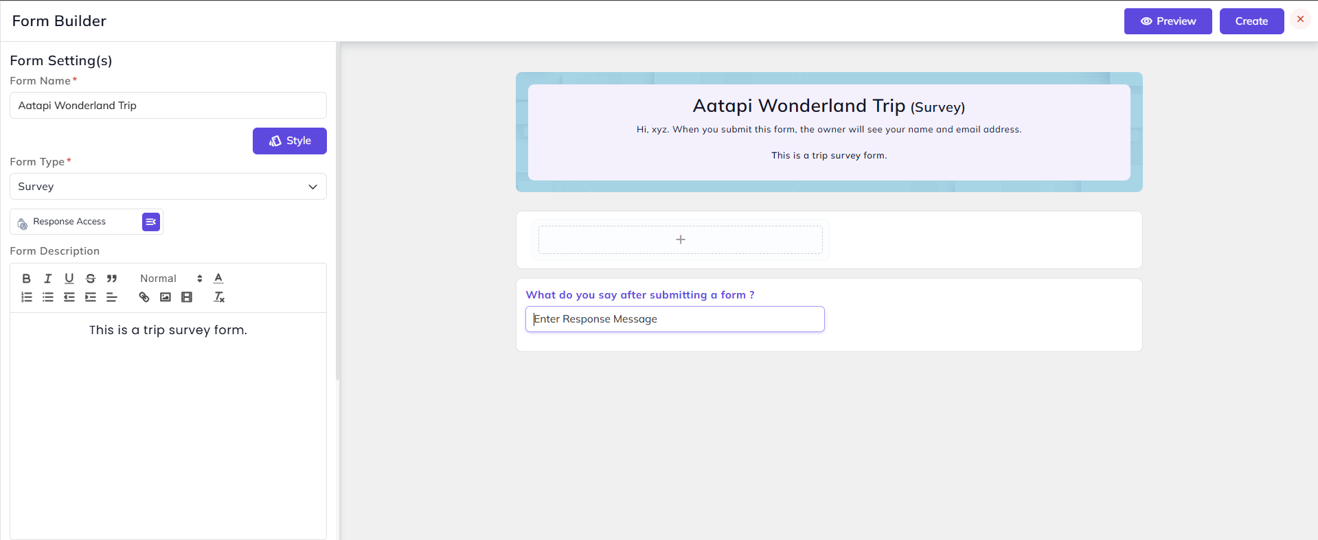
7. Enter any Link in the form that you'd like to display after the form is submitted.
8. Add the Subtitle for the page.
9. Set the Expiry Date and Time if you want to make the form link expire after a certain period of time.
10. If you want the option to Save As Draft for the form, select Yes in the Save As Draft Button Setting and enter the Draft Button
Name. You can also define if the draft expires or not after certain days.
11. Click on the "+" button next to the Page(s) to add more pages and you can also edit the page names.
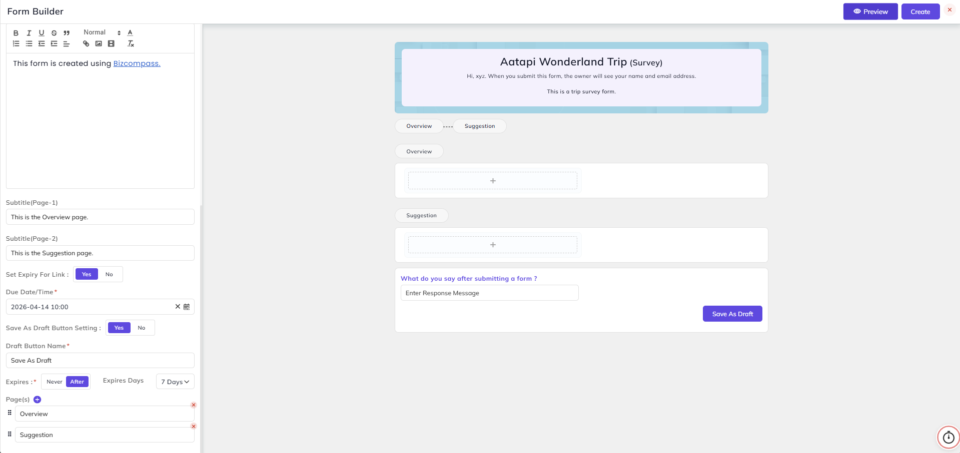
When you click on the "+" icon in the form, a new section will open which will show the Available Field Types.
Choice Field:
- In this field, you can add a label and its related choices. The choice type can be Radio, Checkbox, Dropdown, or Multiple Selection.
- You can also add the Subtitle and Help Text.
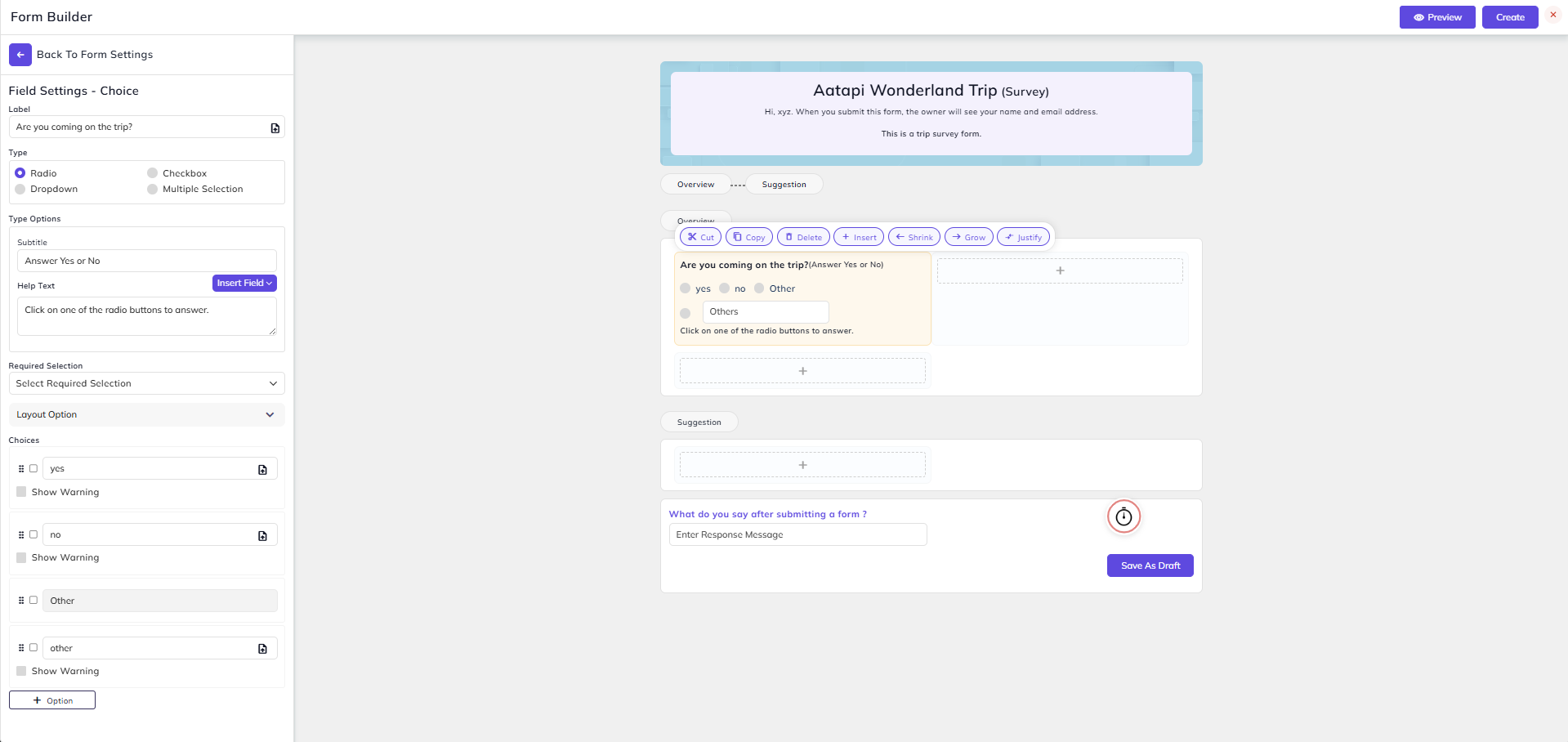
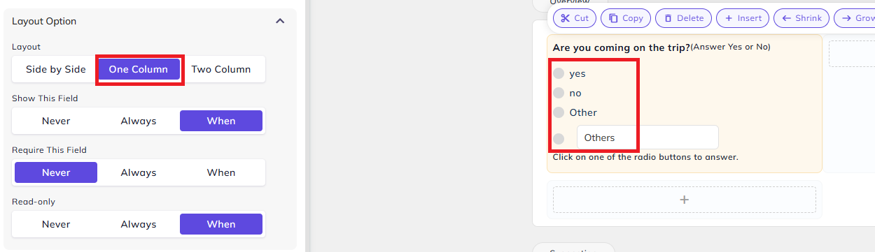
In Layout Option, you can select how the options will be displayed (side by side, one column, or two column) in Layout option.
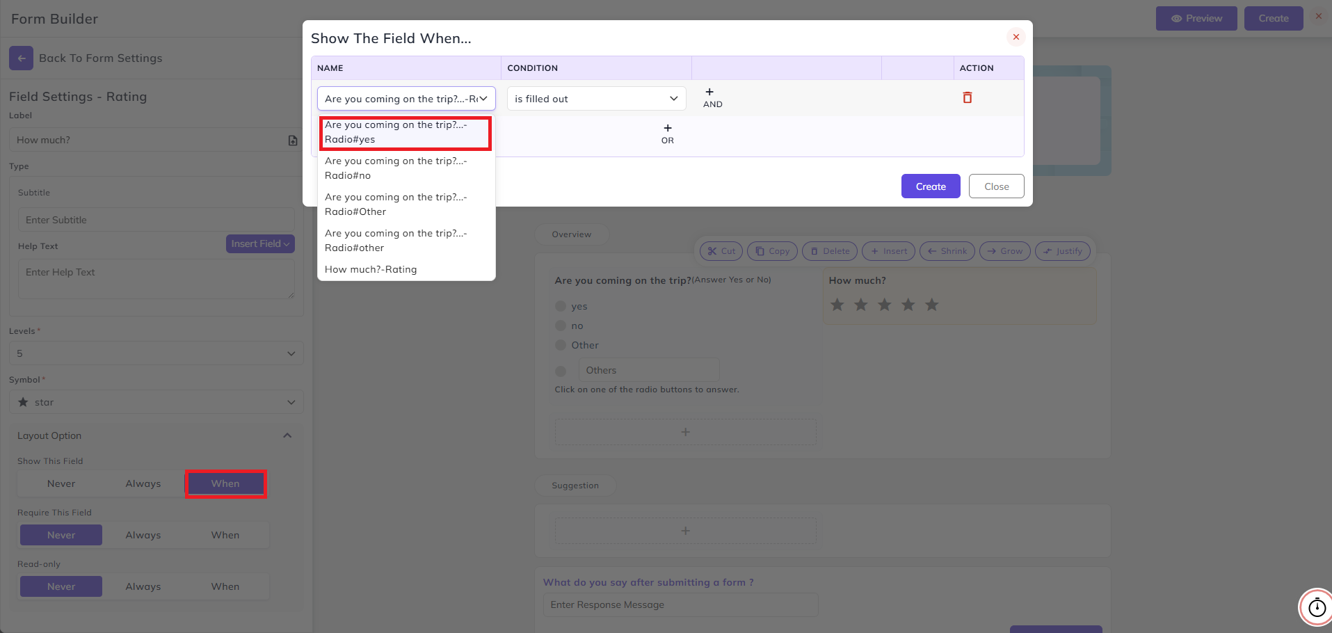
Rating Field:
- In this field, you can add a label, its level and symbols.
- In the Layout Option, you can customize when this field will be shown based on one or more conditions.
- For that, select When in Show This Field option. Then you can select if the current field should be shown based on some other field's answer selected.
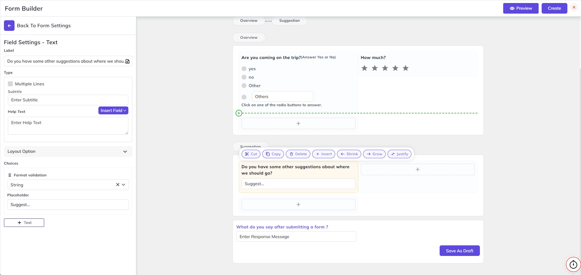
Text Field:
- Now let's create some text fields in the Suggestion page of the form. In the text field, you can add a label and set the format validation (String, Number, Number+String, etc.) for the answer.
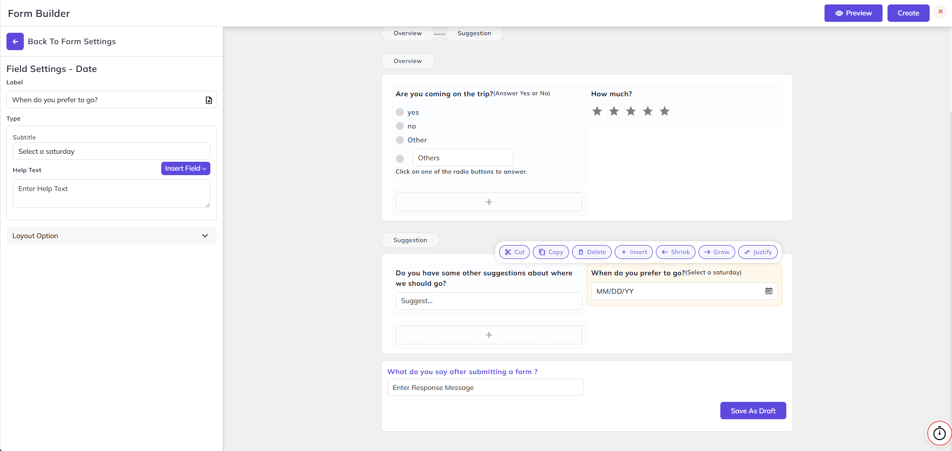
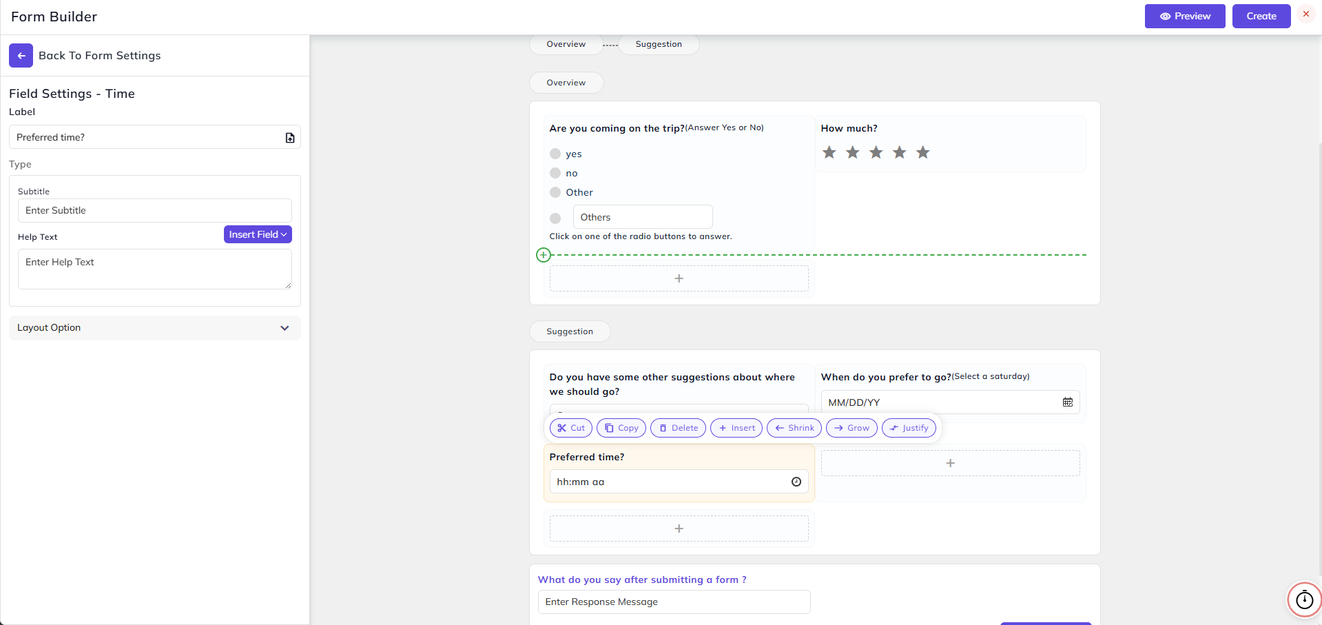
Date and Time Fields:
- In these fields, you can add a label and answer will be in the form of a selected date or time.
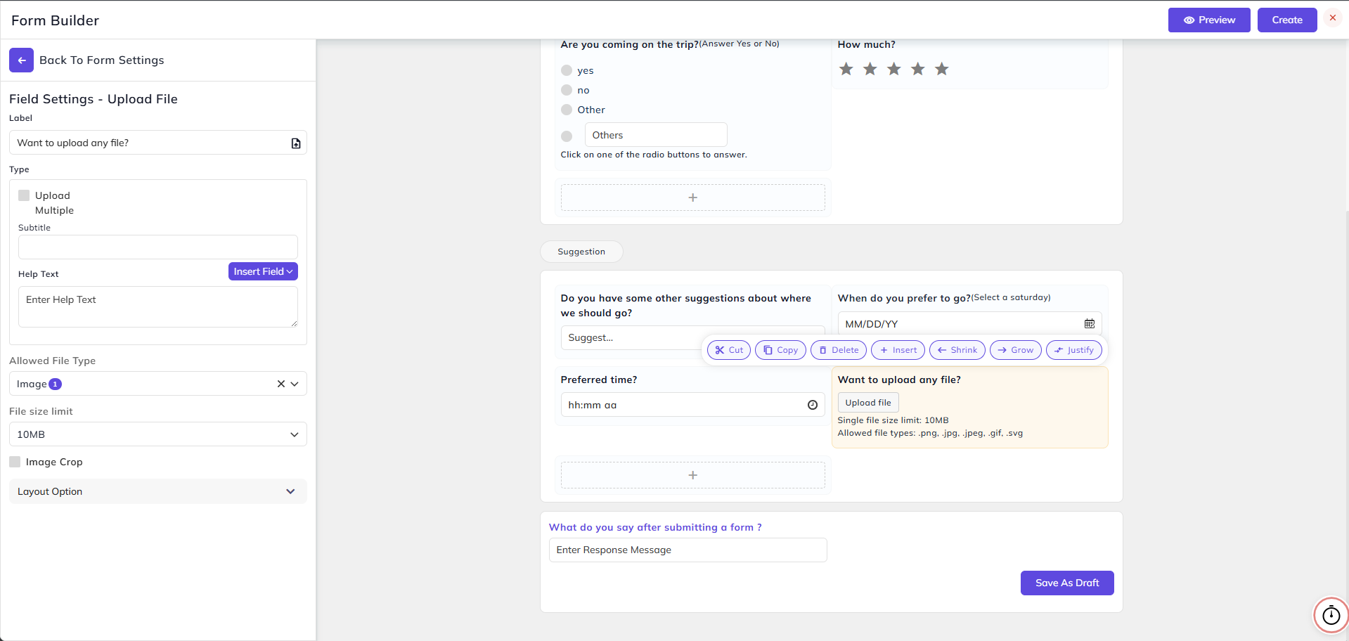
Upload File Field:
- In this field, you can add a label and the answer will be in the form of a file uploaded.
- Check the Upload Multiple option if you want to provide the option to add more than one file.
- Select Allowed File Type (Image, Video, Audio, or Document) and File Size Limit (10 MB, 100 MB, or 1 GB).
- Select the Image Crop option if you want to provide the form fillers with the option to crop their image before uploading.
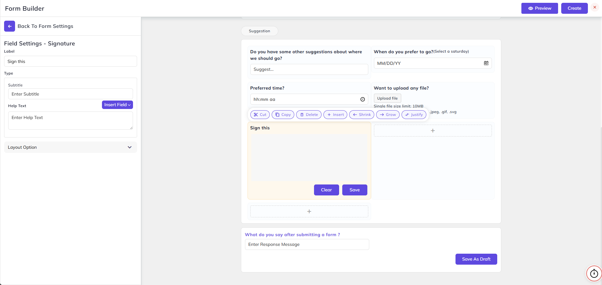
Signature Field:
- In this field, you can add a label and answer will be in the form of a signature.
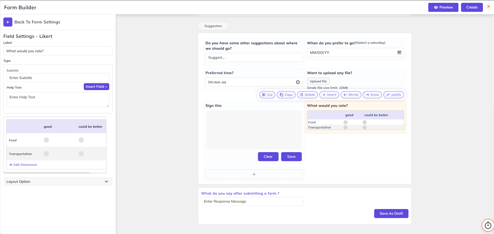
Likert Field:
- In this field, you can add labels, statements, and options as shown below.
Repeat Section